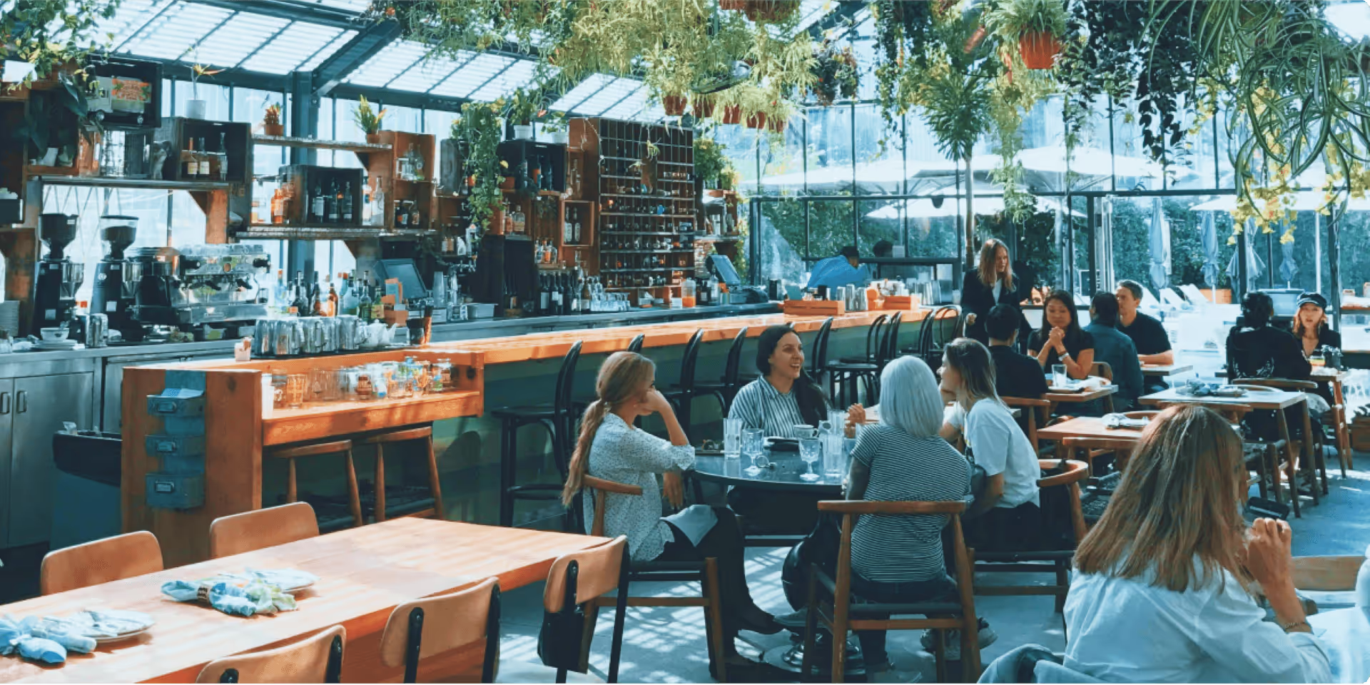
Every restaurant is unique, having unique flavours, and even a soul (so-to-speak), but that doesn’t mean there aren’t similarities between them. For instance, if you look into the best restaurant websites, you’ll discover that they share some of the same essential elements.
In this article, we’ll take a closer look at some of these elements, as well as techniques you can use to help take your restaurant’s website to the next level. Let’s get into it.
Essential elements of a restaurant website
If you want to have a top-performing restaurant website, there are a few things you need to focus on, both in terms of marketing and the website’s basic construction. Below, we’ll discuss essential website elements that can help propel you forward.
Great restaurant brand story
Storytelling is an essential marketing tactic (storytelling in travel marketing for instance), and establishing a good brand story for your restaurant is essential if you want to see results.
Setting up a great brand story will not only make you memorable, but it will help customers to understand what you stand for and where you come from.
Some elements that can help make your story fuller and more convincing include your brand logo (which should fit in with the brand story you’re trying to convey), as well as plenty of photos and descriptions.
When you’re using this technique, it’s vital that you highlight your restaurant’s mission, values, and USPs (unique selling points). Doing so will help you to forge an emotional connection with your audience.
You also need to ensure that your brand story remains consistent on all of your platforms and marketing channels, and isn’t different on the website.
Easy to update
When trying to set up a great restaurant website, it’s easy to underestimate the value of a website that is easy to update. If it’s too difficult to keep updated, the chances are good that it will always be a little bit behind.
Having an all-in-one system that’s easy to keep updated will ensure that customers find the website easy to navigate rather than getting bogged down in frustration.
Choosing a website platform that’s easy to use (even if you’re not a tech fundi) is essential if you want your website to prosper.
Webflow is an ideal option as it's highly intuitive and offers tools and features specifically for restaurants use. This will make it considerably easier to keep your website up to date.
If you use this wonderful provider, you'll be able to build a convenient, all-in-one website that's easy to manage and keep up-to-date.
Mobile-friendly design
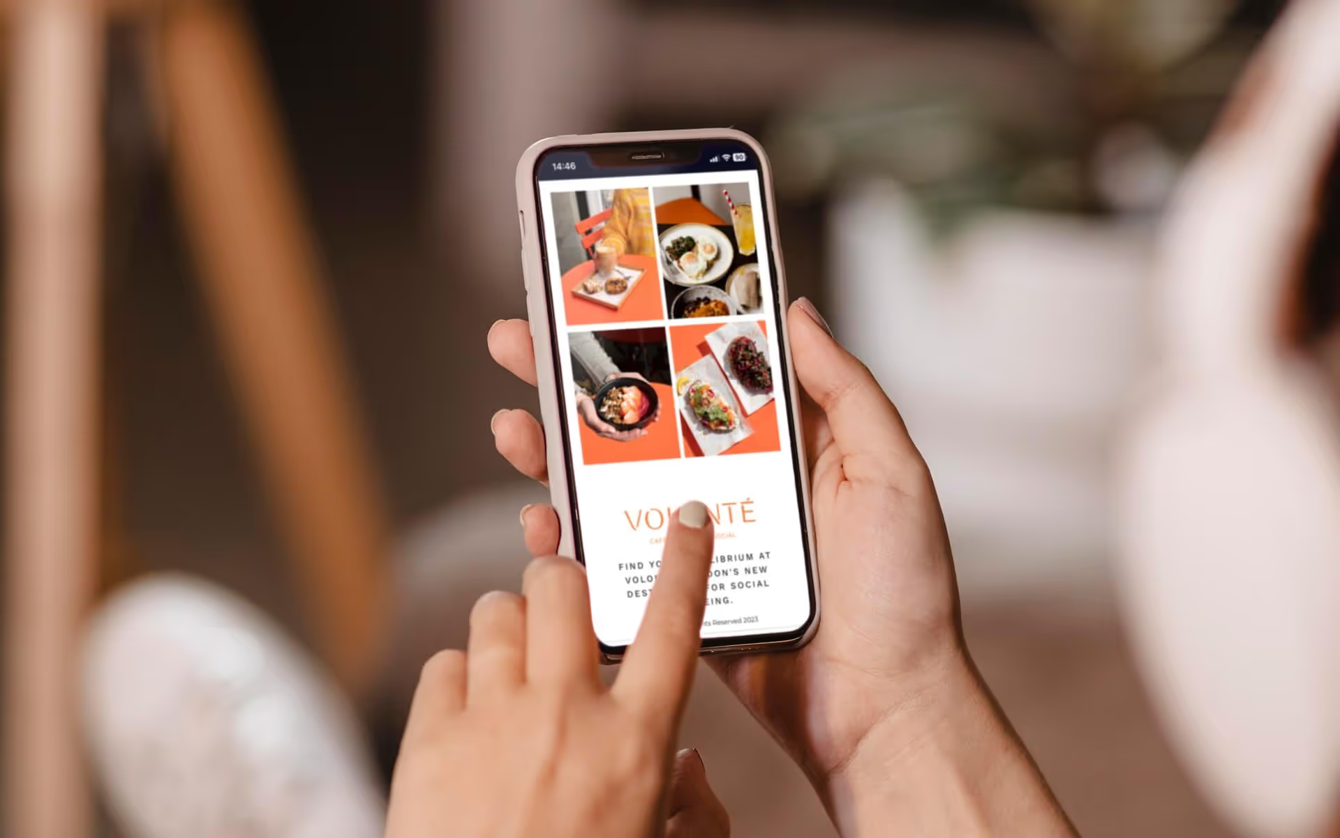
Today, mobile internet usage is far more common than browsing on a desktop or computer. In fact, more than 60% of website traffic today comes from mobile devices.
This means that your website needs to be completely optimised for mobile use. Not only will this help improve your search rankings, but it will boost the user experience for at least 60% of your audience.
This means that your website needs to be able to change orientation readily to accommodate mobile users. Your images also need to be compressed enough not to slow down a mobile webpage.
Ensuring that you choose a website platform that’s well equipped for mobile is a brilliant stepping stone.
E-commerce capabilities
All of the best restaurant websites have e-commerce abilities. Whether it allows people to place advanced orders and then pick them up at the restaurant, or allows you to order takeout and gift cards, e-commerce is an essential part of a great website.
Most customers today are used to being able to get what they want on a website with minimal effort. This makes e-commerce essential, especially if customers can make bookings and buy gift cards online.
However, it’s also essential to ensure that your on-the-ground setup and online setup are integrated. Doing so will help you to avoid embarrassing mistakes like cross-bookings.
Location and contact information
It’s also important to ensure that the people who visit your website can easily find all the information they need. From your trading hours to the website’s location and contact information, your customers don’t want to have to search for the things they want to know.
This is one reason why many of the top restaurants often have their basic information in the website’s footer. It makes it easy to find all the relevant information. Alternatively, having an about us page is an ideal way of giving everyone the information they need.
Professional photography
Professional photography is one of the cornerstones of almost any website, and the top restaurant websites share this aspect. High-quality, professional photography will help to highlight the atmosphere and aesthetic of your restaurant.
Hire a trustworthy professional photographer to take the photos for your website, as these may be the first impression of your restaurant that new people get. It’s also vital to ensure that the photos are high-resolution and show details clearly.
Finally, you may wish to consider using unified backgrounds and colour themes to ensure that every photo helps to emphasise your brand image.
Up-to-date text-based menus
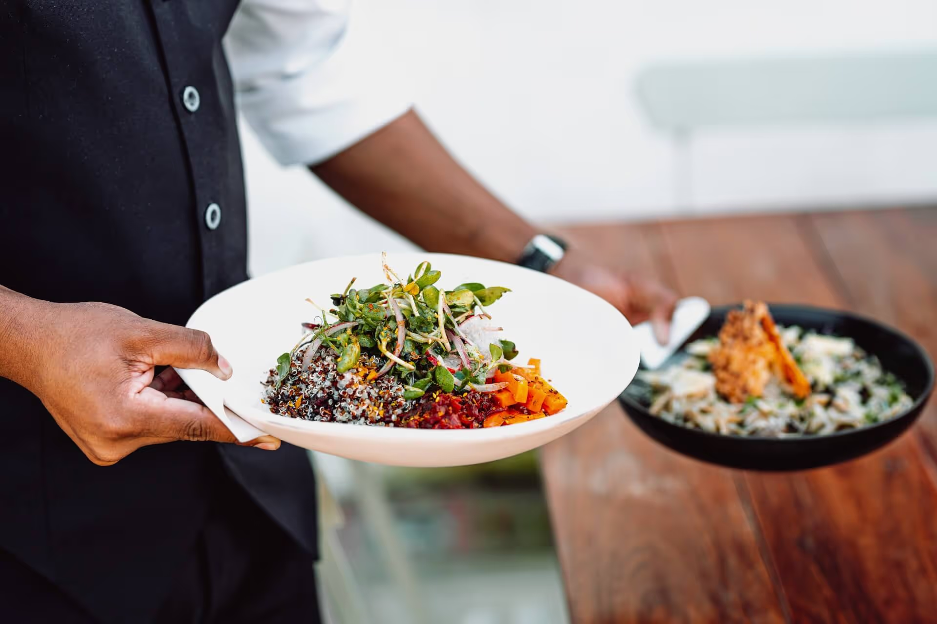
Another essential element of a great restaurant website design is the text-based menu. Having a text-based, rather than image-based, menu allows search engines to analyse and catalogue your menus.
This means that when people search for specific dishes in your area, they can easily track down your restaurant. It will also make it easier for people to read your menu when the connection is weak.
You also need to ensure that you’re constantly updating your menus. If your menus and prices aren’t current, people may develop a negative opinion of your restaurant when they come to the store and find these inconsistencies.
Prominent reservation and online ordering buttons
Making it easier for customers to make reservations or order online can promote conversions for your restaurant. As a result, you need to ensure that these forms and buttons are prominent.
Placing these buttons, and their accompanying CTAs prominently on the homepage is a good way of improving your website and helping to increase conversions. The buttons themselves should link to a reservation system or online ordering system that reflects within the restaurant.
By applying these two things together, you can increase your conversions and still keep track of all your reservations and orders.
Design principles to keep in mind
When it comes to excellent restaurant website design, there are also a few major design principles that most of the best restaurant websites demonstrate. Some of these include the following:
- Contrast - Using differences in colour, shape, shading, and texture can help you to create visual interest and attract a viewer’s eyes to specific parts of the web page. When correctly applied, it can help add distinction and weight to fonts, distinguish certain elements, and make text easier to read.
- Repetition - Almost all marketing tactics incorporate repetition in one form or another, and web design is no different. Repeating your brand’s imagery, colours, and design elements can create a sense of unity, and familiarity, as long as it is used within reason.
- Unity - It’s essential to ensure that all the design elements on the page form a sense of unity. They need to have consistent (or at least intentional) spacing, and contrast should serve to emphasise rather than distract. A balanced layout and consistent colour palette are essential in helping to create a cohesive whole rather than a hodgepodge of individualistic elements.
- Balance - Distributing visual weight equally across a webpage is essential if you want to build one of the top restaurant website designs for your business. It’s important to use either a symmetrical, or artfully asymmetrical, balance and to incorporate the use of empty or “white” space to help maintain balance throughout the web page.
- Hierarchy - All websites have a form of design hierarchy with items and elements of greater importance being constructed to have more effect and visual attraction than others. It’s vital to place important elements prominently and to use font size and coloration to distinguish headers from one another and from the body text.
- Scale - Bear in mind that the scale of the different elements can significantly affect how people see and interpret them. For this reason, it’s vital to use different scales to accentuate certain parts of the webpage, and minimise others.
Additional key components for high-converting websites
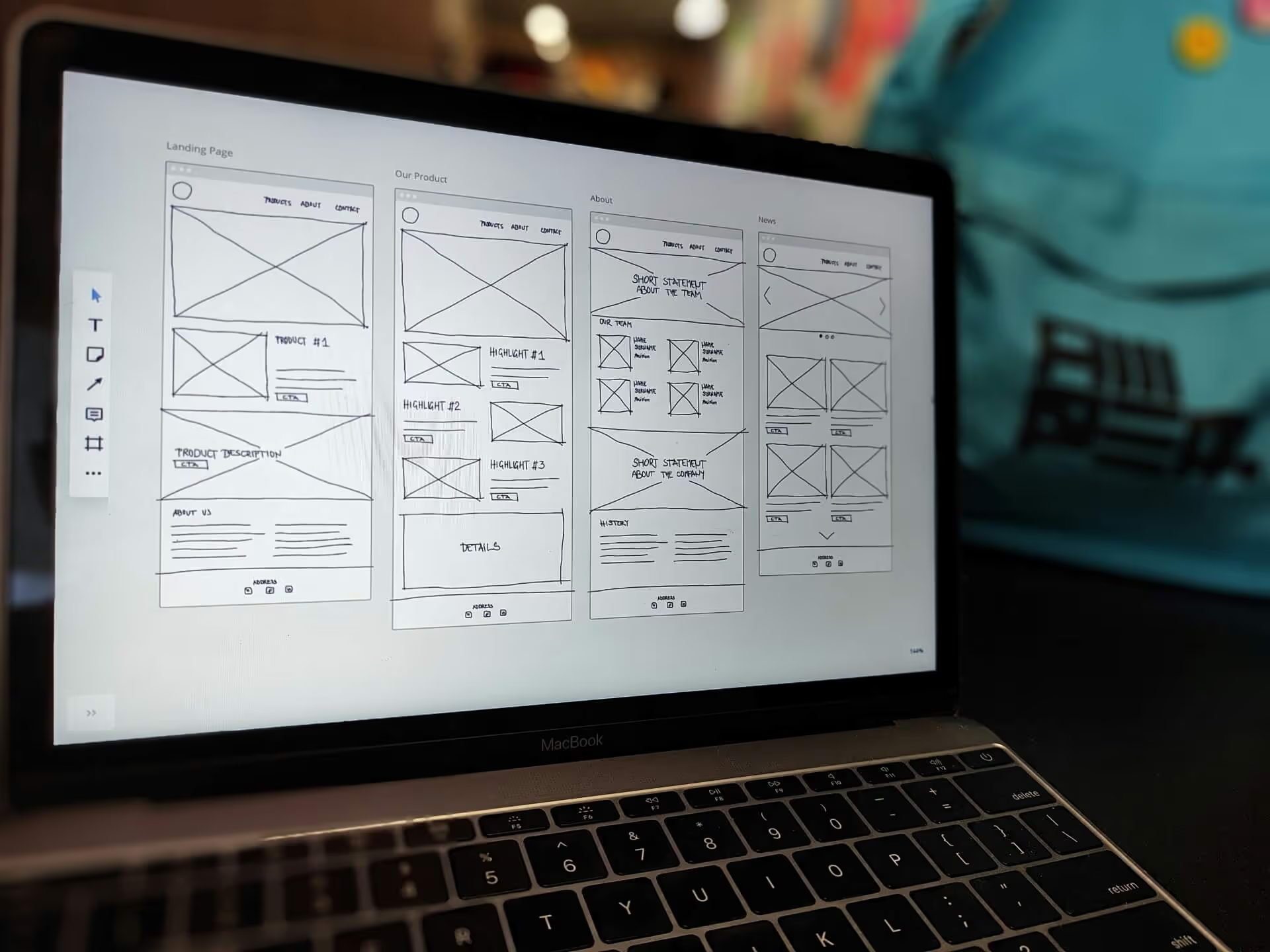
For the best restaurant website design, there are a few additional components that most of the top restaurant websites share. When designing your website, try to incorporate all the following elements:
A clean, simple, mobile-friendly design:
The best restaurant websites with the highest conversions prioritise clarity and ease of navigation. The focus is on ensuring a consistent experience across all devices, and optimising the website for fast loading times. Too often, people try to cram too many elements into what should be a simple, easily navigable web page.
Users want efficient, easy access to all the information about the restaurant without going to a lot of effort. They also want to have access to everything from the convenience of their phones. The restaurants that deliver these things invariably fare better than their counterparts.
A beautiful, compelling online menu:
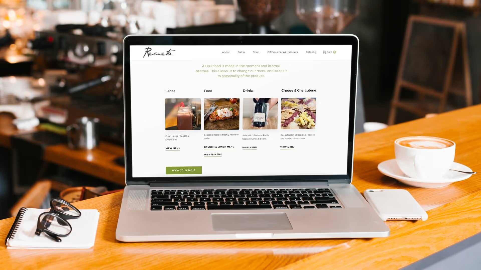
Another aspect that the top restaurant websites excel at, but other restaurant websites often fail dismally at, is menu construction.
There are three main requirements here: Simplicity, intuitive navigation, and quality imagery.
It’s good to use high-quality food photography so people can see what it is they’re ordering. Remember to keep images updated if there are any major changes to avoid unpleasant surprises for the customers.
You also need to provide concise, yet enticing descriptions. People don’t want a confusing soliloquy, but they don’t want the food to sound boring either. Try to provide an exciting description without straying from conciseness.
Finally, it’s best to organise the menu so customers can navigate it easily. For example, placing the desserts between the starters and main meals would be confusing for customers, so the may find it frustrating. Placing the desserts after the main meals is more intuitive.
A high-converting checkout experience:
Again, people want processes to be as simple as possible, so you need to streamline your checkout experience for the best possible experience.
The best way to do this is to minimise the required fields so they’re as simple and effective as possible.
You also need to display trust signals that help customers feel like your site and restaurant are trustworthy. Some of the best ways to do this is by including customer reviews in the sidebars of the checkout page. You should also try to use secure payment badges and offer reassurances about your refund policies (where applicable)
Highly visible social proof:
Social proof is an essential element, not only for your users, but also to help you rank well on search engine result pages.
Forms of social proof include everything from rewards and accolades the restaurant has received to positive reviews left on social media. Almost anything that helps to reassure potential customers about your abilities as a restaurant qualifies as social proof.
Try to incorporate social proof throughout the website, so that it’s prominent but not overwhelming. It’s also good to link to the reviews and accolades where possible, since it’s good Marketing SEO, and allows readers to view the pages for themselves.
Conclusion
While each restaurant is unique, there are some elements that all of the top restaurant websites share. By incorporating these elements and design styles into your own website’s design, you can easily propel your website forward.
You also need to emphasise solid marketing techniques and SEO to ensure that your website gets good traffic and is easy to find. By following the directions given in this article, you can create one of the best restaurant websites imaginable.
If you’d like more help, feel free to contact us. We’d love to offer our services and advise you about how to make your website one of the best.

